


I am an independent AWS consultant providing services through my company 1way2cloud GmbH. If you would like to engage me on your project, feel free to contact me directly at nemanja@1way2cloud.com.
One of the big challenges in AWS is trying to understand what resources are being used and where. It is very easy to spin up new resources and even easier to forget about them (until you get reminded by the AWS bill at the of the month).
There are two options how you can see a list of used resources in your AWS account:
- AWS Config -> Dashboard -> Resource inventory
- AWS Resource Groups -> Tag Editor
Both options will show a list of resources with possibility to filter them per regions and specific services.
However, a list of resources doesn’t tell you how these resources are being used, what is the dependency between them and in general, what is the architecture that the resources are part of. When I start a new engagement with a customer, first thing to do is to inspect what is there in the customer’s account. Like that I can make recommendations to e.g. improve security, reduce costs etc.
What I really want to see is a diagram that shows an application architecture in AWS.
There are several tools that exist out there that can do this kind of architectural visualization. In this post I will go through some of them and see how they rank.
To compare, I will use a fairly standard IaaS deployment in AWS. It consists of a single VPC, that has Internet Gateway attached to it and has public and private subnets. In public subnets is Application Load Balancer and NAT Gateway and in private subnets are EC2 instances (one in each private subnet). There is also DynamoDB database that EC2 instances are using to store some data.
Ideally, what I would expect to see is something like this:

This is a standard Web application deployment on EC2. I took that template from my AWSPlayground platform. You can learn about different configuration options on AWSPlayground and even generate CloudFormation scripts to deploy selected configurations to your AWS accounts. I tried to provide detailed explanation about each configuration. Feel free to play around.
Now we will look at some of the tools that can generate diagram as the one above. Well, at least they will try to generate and we’ll see how they compare. There are two types of these tools. The ones that require access to your environment and the one that work with CloudFormation scripts of your environments. Those ones that require access to your AWS account will provide you with a CloudFormation script that would generate an IAM Role in your account. They would then assume that role and get read only access into your environment to collect information about resource usage. The ones that work with your CloudFormation scripts are non-intrusive. They only look in JSON/YAML files that you provide.
In case you don’t have your environment scripted in CloudFormation (which is generally a bad practice) you can use some third-party tools to reverse-engineer your environment into CloudFormation. Probably the most relevant one is CloudFormer2, which works as a plugin in Chrome and Firefox browsers.
Ok, let’s go through the list of tools I evaluated. They are ranked in descending order.
Disclaimer: I am not affiliated with any of these tools. If you think your tool should be evaluated as well, let me know and I’ll be happy to write a follow up post evaluating your tool as well.
Place 8: AWS CloudFormation Designer
AWS CloudFormation Designer is an official tool from AWS. You can use it to create new CloudFormation scripts from scratch, by dragging and dropping resources on the diagram. The tool creates both JSON and YAML scripts and does the validation on the fly. That is quite useful.
However, generated diagrams from existing CloudFormation scripts are not very intuitive. It’s hard to look at them and understand what is happening.
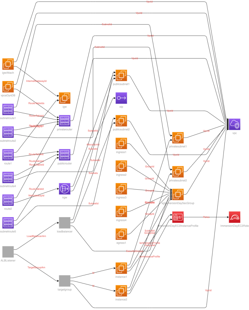
This is how our architecture from above looks like in AWS CloudFormation Designer:

Lines show relations between resources and dots (pink and purple) show resource properties.
I don’t think this amount of details is necessary. The UI is not user friendly, but that is AWS. They are not in the business of making things beautiful. 🙂
Rating:
Pros:
- integrated with AWS Management Console
- CF conversion JSON <-> YAML
- on the fly CF script validation

Cons:
- unreadable
- too many lines and dots
- icons showing both services and properties (e.g. security groups)
Place 7: cfn-diagram
cfn-diagram is a CLI tool that is used to visualize CloudFormation, SAM and CDK templates. It is very simple to use and output can be generated for Draw.io or HTML representation. It is an open source tool, available without any fees.
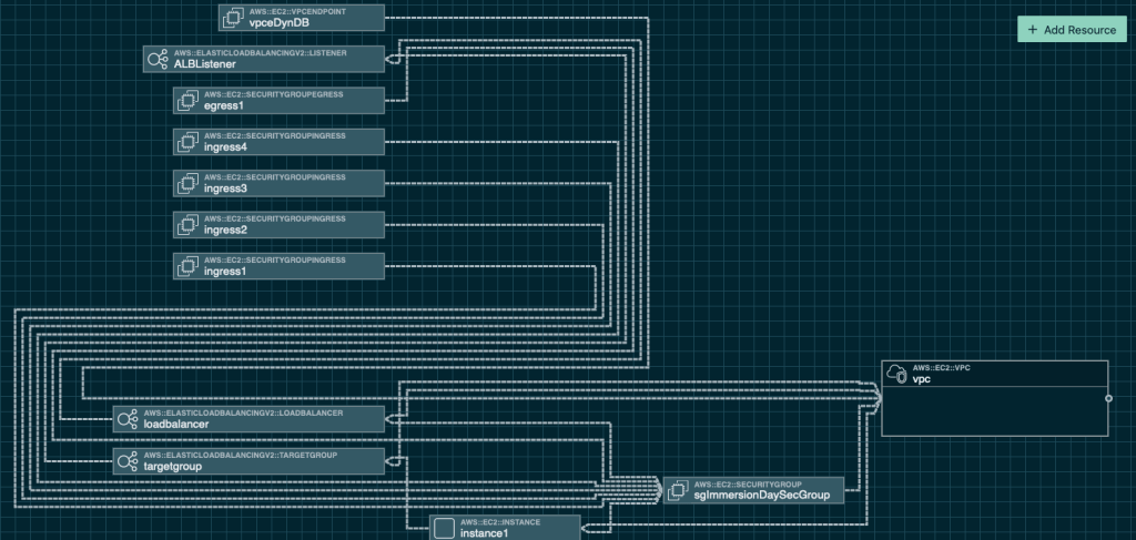
When I started cfn-diagram with my AWSplayground.json CloudFormation template, this was the output:
It is not very useful representation of my architecture. For a simple CloudFormation template that I provided, there are too many details shown. I can just imagine what would be when I would use some fairly complicated template.
I am putting cfn-diagram one place ahead of AWS CloudFormation Designer just because they have put an extra effort to use the latest AWS icons and provide output in useful format such as Draw.io, that can also be viewed in VS Code.
Rating:
Pros:
- Draw.io and HTML outputs
- usage of latest icons

Cons:
- unreadable
- mixture of icons showing both services and properties (e.g. routes, subnets)
Place 6: Lucidchart
Lucidchart is a general purpose drawing tool. It is comparable to Draw.io for example. Difference is that Lucidchart provide integrations to many platforms and unlike Draw.io you have to pay a license.
After connecting my AWS environment to Lucidchart, my web application was visualized like this:

This does look appealing as it looks similar to what I would have drawn on my own manually. There are no unnecessary lines connecting resources or some other detailed properties on the diagram.
However, many things are missed. DynamoDB, NAT gateway and Internet Gateway are not shown.
Rating:
Pros:
- close enough to manual drawing

Cons:
- license required for integrations
- some services not picked up
Place 5: Stackery
Stackery is actually a tool for serverless development packed with interesting features, such as designing serverless stack, local deployment and testing. However, they claim that can visualize non-serverless environments as well. That’s the reason I included them in my comparison list.
The result is following:
Not great unfortunately. One EC2 instance is completely missed. Other services are correctly picked up. For me the generated layout doesn’t look very readable. Also, there are security group rules ingress/egress shown, which I think are not needed to be there.
I am putting it on place 5 because it has a Free plan that you can use to design, manage and visualize your environments. Diagram creation is not their strongest point but there are plenty of other interesting features for serverless development that are not seen in other tools.
Rating:
Pros:
- feature rich
- Free plan

Cons:
- diagrams not easily readable
- some services not picked up
Place 4: CloudCraft
CloudCraft is a seriously nice tool! If you are drawing AWS diagrams from scratch, I would definitely suggest using CloudCraft. Their 3D layout is just beautiful! You can also see estimated cost of your environment as you are adding elements on the graph. On top of it, they have a Free pricing plan for individual usage.
If this was a post about drawing diagrams from scratch, CloudCraft would take 1st place. But, this is other kind of post, where we want to visualize what we already have in our AWS environment. In this area, CloudCraft is not doing such a great job. Visualization feature is not part of Free pricing plan. You need to go to Pro pricing ($49 user/month) to be able to use it. Luckily there is 14-days trial period for Pro plan, so you can try it and cancel subscription if not satisfied.
CloudCraft connects to your AWS environment by asking you to create a new role in your AWS environment, which they can then assume and inspect your resources. My AWSPlayground web application was represented like this:

A bit poor visualization I have to say. It did pick up correctly that there are 2 EC2 instances and DynamoDB table. It missed showing Application Load Balancer, NAT Gateway and Internet Gateway. Additionally it showed two S3 buckets that exist in my environment but have nothing to do with the application itself. Ok, to be fair the tool cannot not if these buckets are needed or not. I am rating CloudCraft better than previous two tools also because of it’s minimalism. Even though it didn’t pick up all the services that are being used, it also didn’t overload the diagram with every tiny detail of used services. These details are not forgotten however, they are in the property popup that comes up when you select a certain service.
Rating:
Pros:
- beautiful layout
- not overloading diagrams with unnecessary details
- integrated cost estimation

Cons:
- not accurate resource collection
- requires Pro subscription
Place 3: Hyperglance
Hyperglance is an interesting tool that supports diagraming for many platforms, and not only that. It comes with cost analysis tool, security & compliance analysis and a very useful aggregated inventory tool.
Our web application has been reverse-engineered like this:
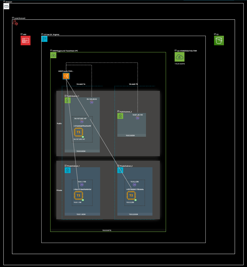
So far the best looking diagram! Hyperglance folks paid a special attention to UX. It is very intuitive to use the tool. For some reason DynamoDB instance has not been picked up on the diagram. That’s the only minus point. Otherwise, the generated diagram looks very well. You can open and collapse components, go deeper into area of interest, close the others that are not important for you at the moment and so on. Very nice representation of AWS environment.
Hyperglance is installed from AWS Marketplace. It will create a new EC2 instance in your environment and the dashboard will be served from that instance. From security perspective this is probably the best way so far. Other tools, that are SaaS solutions, require access to your environment. Even though it is ViewOnlyAccess, information about resource usage is flowing outside of your environment.
Since the tool is coming from AWS Marketplace, you pay usage per hour. For up to 100 scanned resources, you will pay $0.43 per hour. That is not bad if you start the EC2 instance, do your thing and then stop it. But if you forget to stop it (which happens in 99% of cases), it will cost you about $300 per month.
Still, very impressive tool! The guys deserve 4 stars rating.
Rating:
Pros:
- nice and readable diagrams

Cons:
- DynamoDB not picked up
- billed per hour, can be very expensive
Place 2: Hava
Hava was a pleasant surprise when I first saw the generated diagram. Modern icons, layout was nice and simple, diagram was readable. Each icon is clickable and details about the each resource is shown on the right hand side in a popup bar.
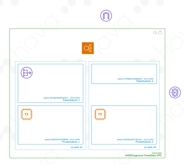
There are some especially nice looking representations, such as this one for security groups:
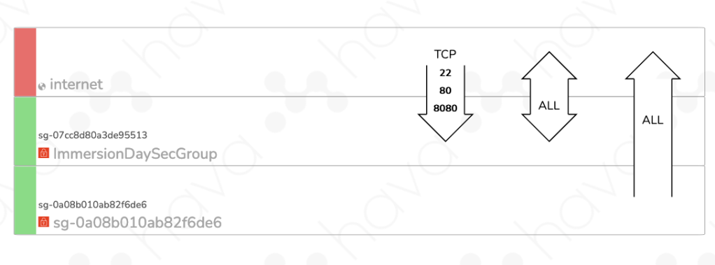
It’s probably the best explanation of security group rules that I have seen so far. Very clearly shows what is allowed for inbound and outbound traffic.
Initially I thought Hava is a clear winner of this comparison. But three things made me put Hava on place 2:
- some resources not picked up, such as DynamoDb
- icons have no labels
- no Free plan, $49/month for a Personal plan is quite expensive
I think all these things can be easily fixed. Picking up more resources is just a matter of supporting them in the tool. Putting labels under Internet Gateway, VPC endpoint, NAT gateway etc. is not a big deal to implement but it helps a lot with visual understanding what is where. AWS is known for not making intuitive icons so a label next to the icon is very needed. As for pricing, I think a free plan for 1 user with limited functionality would be beneficial. Especially that many other competitors have such Free plan.
Rating:
Pros:
- good looking diagrams
- nice introspection tools

Cons:
- DynamoDB not picked up
- no Free plan
Place 1: Quadzig
Quadzig is a new kid on the block. Even though it is still in Beta, it does put many other established players to shame. We’ll have to see how they progress and if they manage to keep up on the current promise, but what I have seen so far does look very good!
Their generated diagram looks like this:

Almost perfect! Almost the same as I would create it manually in Draw.io. Modern icons, nice layout, enough information on the diagram, icons have labels. Not sure why my account was automatically named “Serpentine Owl”, the other one was “Calamitous Deer”. I guess the authors are wildlife lovers or hunters. 🙂
DynamoDB is not picked up in the diagram, which I will say is ok while they are in Beta phase. Won’t be forgiven once they go live.
Quadzig is super simple tool and does one thing only, infrastructure visualization, but it does that very well. There is a Free plan for individual users.
Great job, 5 star rating. Keep it up!
Rating:
Pros:
- modern looking diagrams
- as close to reality as possible
- Free plan

Cons:
- DynamoDB not picked up
Others
These 7 tools are not the only one that are out there. It is worth mentioning few other tools that I came across but for various reasons wasn’t able to use them in the current evaluation.
- CodeShield
CodeShield looks really promising! It is not available yet, they say it is coming early this year.
- CloudMapper
CloudMapper seems to be doing nice job at visualizing the environments. But I wasn’t able to install it on my laptop. I am using Python3.8 and receiving a whole bunch of errors during the installation.
Bonus
If you have come this far, you deserve a bonus. 🙂
Diagrams is a very nice tool that lets you draw the cloud system architecture in Python code. Using “Diagram as Code” approach you can track the architecture diagram changes in a version control system.
Here is an example of python code that creates diagram in Figure 9.
from diagrams import Diagram
from diagrams.aws.compute import EC2
from diagrams.aws.database import RDS
from diagrams.aws.network import ELB

with Diagram("Grouped Workers", show=False, direction="TB"):
    ELB("lb") >> [EC2("worker1"),
                  EC2("worker2"),
                  EC2("worker3"),
                  EC2("worker4"),
                  EC2("worker5")] >> RDS("events")

Conclusion
Automatic generation of cloud resources is not an easy task and is ever moving target. With cloud vendors innovating at incredible pace, these tools have almost impossible task trying to support all the services and features.
Still, some are doing better job than others. Tools that have laser sharp focus on one thing only generally have better chance of doing that one thing right. Focusing on one cloud only and only on doing diagramming right, gives an edge to tools like Quadzig when compared to others.
